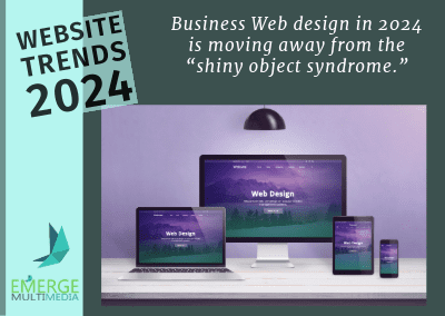
Business Web design is moving away from the “shiny object syndrome.”
The old adage about knowing your customer has never been more critical to creating the online journey through your website. Are you dealing with a first-time user, a returning customer, or a real power user? Each of these website visitors creates its own demands and expectations of the process and the brand.
The past few years have seen flashy cartoon-y animations and bright colors drive website design. Unconventional layouts overtook grid and block structures. While fashion trends and imagination with typography and color drew visitors’ attention to key messages, the fine line between effective user experience versus visual overload was easy to cross.
K.I.S.S Design Minimizing the Distractions
Now it’s not just about how a site looks, but how well it understands and impacts its users, making every online interaction more engaging and meaningful. In 2024, web design trends are evolving to prioritize more immersive and personalized experiences. Keeping the user informed and focused by removing anything that detracts from the message or the desired action is what is driving design.
What about AI?
Everywhere you look online there is talk of artificial intelligence (AI) tools making everyone in tech excited and most everyone else very nervous.
Where AI can shine is behind the scenes in web creation supporting search engine optimization (SEO.) AI text tools allow developers to generate keyword-focused copy intended for specific page types and intents, meta descriptions, and meta tag generation.
At this stage of its development, the industry consensus is the AI management of the user is more of an interference. There is a definite wait-and-see attitude against introducing ever-evolving user-based AI tools and features, to avoid user confusion and frustration. AI seems more strongly poised to expand into non-internet industry applications.
Let’s Take Advantage of What’s Here to Stay
Here’s the quick version of website design trends:
- Clear and easy navigation – make what your customers are looking for intuitively obvious, no place for cutesy esoteric titles and descriptions.
- Move toward simplification – fewer keystrokes.
- Elegant minimalism – fewer distractions, more focus on the task at hand.
- Extra large call to action (CTA) buttons
- Departure from classic sidebar elements and widgets – they don’t play nice across dynamic screens.
- More blurb and card layouts – independent components easily rearranged or customized, think bentobox.
- User Connection – Focus, focus, focus on turning user needs into desires.
The world of web design isn’t just about adapting to changes — it’s about leading the charge toward a more immersive, interactive, and intelligent digital future. Understanding your target audience and your brand helps build beautiful, functional, and user-friendly sites.
Want to Learn More?
Explore how timely website updates and other strategies can increase your business security. Connect with your Emerge Multimedia team: Amy, Janet and Nadine!

